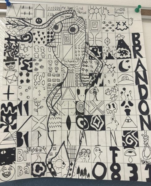
FART(left): Unsure what the fart this is even supposed to be. I can make out a mouthless face with a wittle weaf coming out the top of the head. The body shape resembles a yam and the little limbs all look like ripped tags. The contrast that was supposed to be applied by coloring some squares in more than others doesn’t really exist. 0831 may as fell just say F A R T. You’re going to need some bromine to try to get the fart smell out of the entire Knoch High School after this was hung up right across from guidance. I’ll give them credit for the attitude the figure portrays though. 90% FART 10% ART.
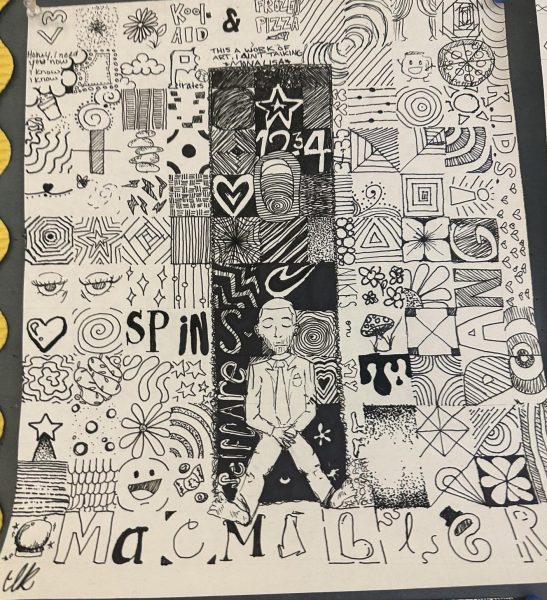
ART(top right): Fartless! The contrast is done very well with the dark squares around Mac Miller make him pop perfectly. I quite like the squares referencing mac miller songs and whatnot and I would declare the overall vibe suits his music very well. He looks adorable per usual. I like his little footsies. It was also perfect timing with his death date anniversary passing recently, which meant much to many. I’m going to give it a solid 95% ART, 5% FART.
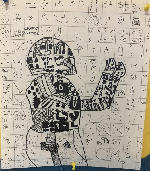
FART(left): Okay!!!!! This is SO fart!!!!! The football he’s catching would probably grow wings and fly the other way as soon as it got within 20 feet of this farter. Although the shading was used well to contrast the outline of the player against the background, it just looks sloppy. Quote from onlooker Dara Patten, “I didn’t even know what it was.” Every square may as well be filled with a fart. Good effort though! Try again, but be sure to try harder. 75% FART 25% ART.
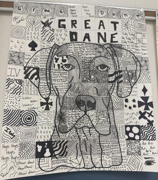
ART(right): :))))))))))))) CUTEEEEE DOGGG!!!!!! One great great dane. This is how the squares are supposed to be used to show contrast, being more filled in instead of just with a thicker marker. His wrinkles are in all the right places and he has properly sassy great dane eyes. I like all the squares they all make me pretty happy admittedly. 100% ART 0% FART.

